
Colour and Personal Style: Understanding Tones, Palettes, and What Flatters You

Key Takeaways
- Skin undertones — warm, cool, or neutral — are the most reliable starting point for finding flattering colours.
- Seasonal colour theory is a useful framework, not a rigid rulebook.
- Neutrals anchor a wardrobe; accent colours express personality.
- Testing colours near your face in natural light is the most practical self-assessment method.
- Personal colour choices should reflect how you want to feel, not just what 'matches' technically.
Why Colour Matters in Personal Style
Colour is often the first thing someone registers about an outfit — before cut, fabric, or fit. It communicates mood, sets contrast, and either harmonises or clashes with your natural colouring in ways that feel immediate and visceral. Yet most first-time shoppers choose colours based on vague habit or passing trend rather than any understanding of what actually works for them.
Getting intentional about colour doesn't mean wearing only one palette forever. It means building a foundation — a working understanding of your undertones and the hues that interact well with them — so that shopping decisions feel clearer and outfit-building becomes far less frustrating. If you're just beginning to explore your personal aesthetic, our beginner's guide to finding your aesthetic is a great companion to this article.
90 sec
Time people form a first impression
Research in consumer psychology suggests colour influences up to 90% of snap judgments about products and people within seconds of first impression.
4 seasons
Palette categories in classic colour theory
The seasonal colour analysis system, popularised in the 1980s, groups individuals into Spring, Summer, Autumn, and Winter based on undertone and contrast level.
Understanding Skin Undertones
Undertone refers to the subtle hue beneath your skin's surface — distinct from your surface complexion, which can be fair, medium, tan, or deep. There are three main undertone categories:
- Warm: Yellow, peachy, or golden undertones. Common in people whose skin tans easily or has a golden glow.
- Cool: Pink, red, or bluish undertones. Common in people whose skin flushes easily or looks porcelain.
- Neutral: A balance of warm and cool, without a strong lean either way.
Identifying your undertone is the single most useful data point in colour dressing. Warm undertones generally look vibrant in earthy, rich tones — terracotta, olive, mustard, warm browns. Cool undertones often glow in jewel tones, icy pastels, and true blues. Neutral undertones are versatile and tend to work well across both camps.
The Vein Test: A Quick Undertone Check
Turn your wrist over and look at the veins in natural light. Green-tinted veins typically suggest a warm undertone; blue or purple veins suggest a cool undertone; if you can't clearly tell, you're likely neutral. This isn't foolproof but it's a solid starting point before you invest in a full palette.
Colour Theory and Skin Tone Are Not the Same
Undertone analysis applies across all skin tones — deep, medium, and light complexions all have warm, cool, or neutral undertones. The goal is never to lighten or alter your appearance, but simply to identify which hues create the most harmonious contrast with your natural colouring.
Seasonal Colour Theory: A Helpful Framework
Seasonal colour analysis — Spring, Summer, Autumn, Winter — categorises people by a combination of undertone and contrast level (how much difference there is between your hair, eyes, and skin). It's a decades-old system that remains widely referenced because it gives practical groupings of colours that tend to work together on similar colouring.
- Spring: Warm undertone, lighter contrast. Flattering palette: peach, coral, warm ivory, light golden yellows.
- Summer: Cool undertone, softer contrast. Flattering palette: dusty rose, lavender, soft blue, muted neutrals.
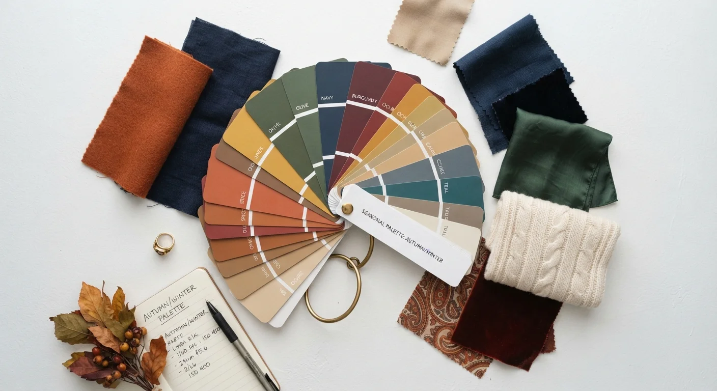
- Autumn: Warm undertone, richer contrast. Flattering palette: rust, olive, burnt orange, warm camel.
- Winter: Cool undertone, high contrast. Flattering palette: true black, bright white, emerald, royal blue, magenta.
These groupings are useful starting points, not strict categories. Many people sit between seasons or find they resonate with palettes across multiple groups. Think of it as a compass, not a cage.
“Colour is a power which directly influences the soul. It is the keyboard, the eyes are the hammers, and the soul is the piano with many strings.”
— Wassily Kandinsky, Painter and colour theorist, author of 'Concerning the Spiritual in Art'
Building Your Personal Colour Palette
A working personal colour palette typically has three layers: neutrals (the backbone of your wardrobe), accent colours (the personality layer), and statement hues (occasional, intentional pops). For a deeper look at how these layers interact in a wardrobe, see our guide on wardrobe colour strategy.
- Identify 2–3 neutrals that genuinely suit your undertone — not just classic black and white by default. Navy, camel, chocolate, warm grey, and cream are all legitimate neutrals depending on your palette.
- Choose 2–3 accent colours from your undertone family that you're genuinely drawn to — colours that feel like you on a good day.
- Allow 1–2 statement colours for contrast or seasonal experiment. These don't need to be 'perfect' for your undertone — they're meant to add energy and interest.
Hold fabric swatches up to your face in natural daylight — not bathroom or office lighting. Artificial light distorts colour temperature and will give you misleading results.
Natural daylight is the most neutral light source and will show you clearly whether a colour makes your complexion look vibrant or washed out.
When in doubt about a colour's undertone, look at the shadows it casts — warm colours cast yellowish shadows and cool colours cast bluish ones.
This trick helps you identify undertone quickly when shopping in store, where lighting conditions are rarely ideal.
If you find outfit combinations still feel 'off' even with colour in mind, our article on why outfits feel off explores the subtler elements at play.
Your Palette Will Evolve — That's Normal
Skin undertones can shift slightly with sun exposure, age, and health changes. A palette that felt right two years ago may need revisiting. Treat colour analysis as an ongoing conversation with your wardrobe, not a one-time diagnosis.
Colour Beyond the Rules
The most enduring style advice on colour is deceptively simple: wear what makes you feel good. Colour analysis frameworks exist to give you language and a starting structure — they're not meant to overrule instinct or personal joy.
Once you understand the mechanics of undertone and contrast, you're equipped to make informed decisions to break them. Deliberately clashing warm and cool tones can look intentional and striking. Wearing a colour 'outside your season' in a way that you love absolutely counts as personal style. The goal is confidence and clarity, not compliance.
Don't Let Rules Overrule Your Joy
Colour analysis frameworks are tools, not laws. If a colour technically sits outside your 'season' but makes you feel confident and alive, that matters more than any chart. Use these systems to inform your choices, not to restrict them.
Style evolves, and so does your relationship with colour. Regularly revisiting what's in your wardrobe — noticing which colours you actually reach for versus which ones hang untouched — is itself a form of self-knowledge. For tools to visualise and refine your direction, our guide on using mood boards effectively offers a practical method to organise your thinking. And if you want to connect colour to the broader structure of how you dress, explore the building blocks of a coherent personal style.
Seasonal Colour Analysis Guide
A structured overview of the four-season colour system, explaining how to identify your season and what palette characteristics accompany each one.
Personal Colour Palette Worksheet
A printable or digital template to log your undertone findings, favourite colours, and wardrobe colour gaps as you build your personal palette.
Colour Wheel Tool
An interactive colour wheel that helps you visualise complementary, analogous, and triadic colour relationships for outfit planning.